|
One of the most difficult undertakings that faces modern rotary aircraft pilots is shipboard landings. The task presents a unique challenge of landing on a moving ship affected with unpredictable shifts in ship deck pitch and relative altitude caused by ocean waves. This project is focused on developing cueing aids to help pilots during this task by improving performance and reducing workload. Different 3D cueing symbologies were created and then tested by pilots in a high fidelity simulator. This work has been conducted in partnership with Bob Walters, College of Aerospace PHD Student.  |
The Visual Policy Initiative aims to transform complex policy issues into easy to understand data visualizations using empirically-derived evidence. The Visual Policy team is comprised of a group of researchers from both public policy and digital media. Through this collaborative effort, we aim to transform complex policy issues into easy to understand data visualizations using empirically-derived evidence. 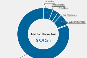 |
The goal of this study is to understand how people interact with tangible user interfaces through play with the intent to support exploration, discovery, and learning of visual narratives. We designed the interactive system with the use of tangible blocks as primary interaction mode in mind, which contain various design elements of sequential art (graphic novels), for creating, editing, modifying visual narratives through different configuration and combination of blocks viewed under a device, such as such as a mobile phone in the form of augmented reality. |
|
|
Visualization Journalism is focused on developing an interface and graphical metalanguage for massive multimodal news datasets. Such datasets are increasingly available, but for copyright reasons, they cannot be made entirely open to the public. The project seeks to offer an abstracted and legal representation of news data, to enable comparative, cooperative and computer-supported analysis of trends across news events and networks. |
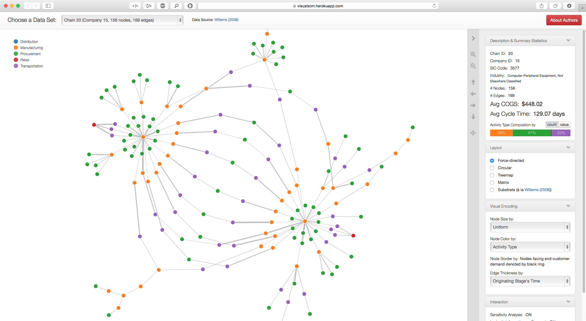
This study describes a data-driven visualization approach to the systemic study of innovations in global supply chain networks. We demonstrate its applicability with illustrative examples of real-world supply chain in the electronics industry. Our visualization approach enhances the hypothesis-generating process as it can reveal important clusters, patterns, trends, and outliers in the networks. 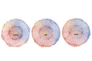 |
The project's goal is to help people to identify some of the variables involved in air traffic safety, and understand that air traffic safety relies on both technology and the people who control it. Hopefully, it will be illuminating to anyone concerned with air traffic safety. |
|
|
The design and production of complex engineered systems (CES) require analysis of massive amounts of detailed information, including data on products and materials, engineering designs, manufacturing specifications, supply chain and delivery data, and changing customer needs. Visual analytics promises to offer tools and methods that will help stakeholders interactively explore, discover, and make sense of the underlying data. 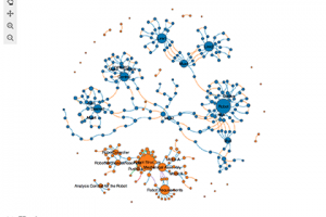 |
There is a scarcity of trained healthcare professionals in India. Further, the current approach to healthcare delivery in India is symptom-driven and fails to address the underlying causes of disease which may be a result of the local socioeconomic, cultural, gender, environmental, or infrastructural situation. Chitra is a mobile platform that empowers community health workers to fill this gap between government healthcare delivery and patients' lived realities. |
A visualization system for portraying the jumps in men's and ladies' single figure skating programs. Data is from the International Skating Union's score tables for world championships in the last 6 years. The objective is to better interpret the score tables by visualizing the program composition of top skaters, as well as showing a trend of the sport in general. |
|
|
The PGA Tour provides an extensive data collection of information about players' performance and individual shots over the past few years. This collection is called ShotLink data. In this project we are building an interactive visualization system that will allow the viewer to easily browse and explore the golf shot data to learn more about the performance of all the players on tour. The system presents a variety of different statistics including scoring, driving accuracy, greens in regulation, putting, and so on. |
We have created a visual interface to explore the history of the top 100 U.S. golf course rankings from Golf Digest and Golf Magazines. A viewer can explore the courses geographically via a map or through the individual ordered lists from the magazines. The system shows how each course's ranking has changed over the years, and it allows the viewer to explore courses by particular architects. 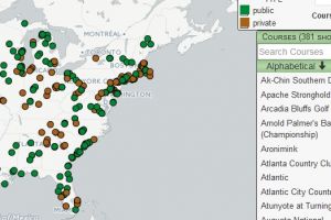 |
Improve the usabilty of a vaccine data visualization, including ways to visualize uncertainty |


